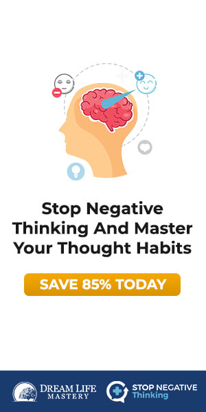
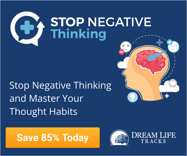
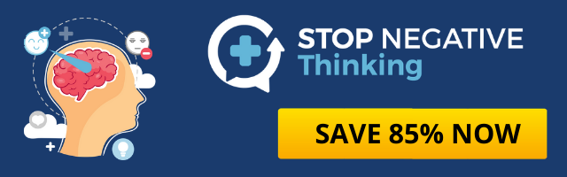
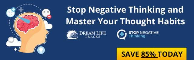
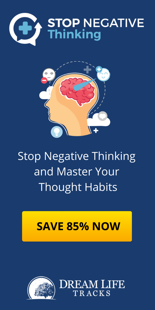
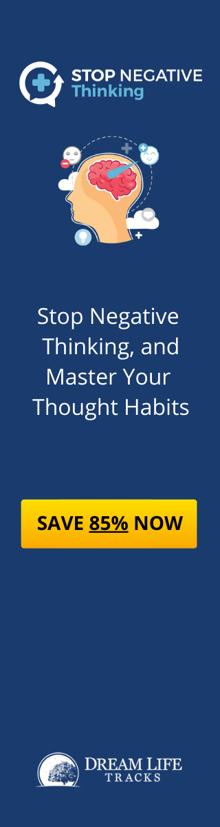
Hi Marion. I'm rather disappointed in the banners you created. You can see some of yours below, and the concepts I asked you to improve further down this page. Your banners are very pixelated, and some of them have no images or logos at all.
Also, they should ideally have "Stop Negative Thinking" on a line of it's own where possible... so that each line reads as an independent statement.
So, for example, the first banner below reads:
Stop Negative Thinking And Master Your Thought Habits
It would be more readable if it says
Stop Negative Thinking And Master Your Thought Habits
The banner that I've given a red border has a better layout, although everything is super pixelated, and the "Save 85%" is far too small.